Details
-
Type:
 New Feature
-
Status: Closed
-
Priority:
 Major
Major
-
Resolution: Fixed
-
Affects Version/s: None
-
Fix Version/s: 4.0
-
Component/s: ACE-Components, MOBI-Components
-
Labels:None
-
Environment:Any
-
Assignee Priority:P1
-
Affects:Compatibility/Configuration
Description
Activity
- All
- Comments
- History
- Activity
- Remote Attachments
- Subversion
Font awesome has been upgraded in ICEmobile to 4.x. The issue now is that Font Awesome in the Ace styles is the older version using the 'icon' prefix. The newer versions use the 'fa' prefix, which is being used in the ICEmobile components, such as the ViewManager. So the icons there are not showing up.
Also note that the ace:radioButton and ace:checkboxbutton components should be modified to use the new font-awesome characters for default state icons.
Suggested icons are:
- checkbox off: fa-square-o
- checkbox on: fa-check-square-o
- radiobutton off: fa-circle-o
- radiobutton on: fa-dot-circle-o
r43044: added FontAwesome 4.2 to ACE
r43045: added new FontAwesome icons to ace:checkboxButton and ace:radioButton.
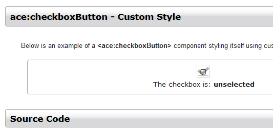
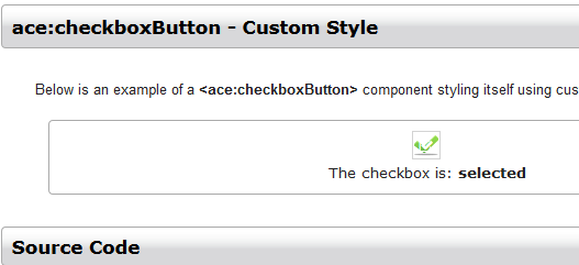
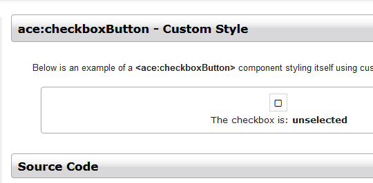
While running regressions to verify this JIRA I noticed that the showcase ace:checkboxButton > Custom Style demo has the following style issues (all browsers). The custom style seems to be over written by the font awesome style. Otherwise there have been no issues found.
1.) Checkbox is selected. You can see the tiny white font awesome over top of the green checkmark. See selected.PNG
2.) Checkbox is de-selected and in this case the mouse pointer is hovering over the checkbox. This is the only way to see the custom grey check-mark.
See hover.png
3.) Checkbox is de-selected. Mouse pointer is moved away from the checkbox. See unselected.PNG
This is also an issue in the radioButton > Custom Style demo, though less noticeable because of the color scheme.
r43048: fixed ace:checkboxButton and ace:radioButton custom style demos to use the new FontAwesome CSS classes.
r43059: committed ace:checkboxButton styling improvements.
r43060: committed ace:radioButton styling improvements.
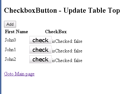
Tested with ICEfaces 4 trunk r43064. After the latest commits there are styling issues for checkboxButton and non-rendering issues with button group in the QA test applications.
1.) checkboxButton in QA test apps show no style until it is hovered over, no style is retained after clicking.
see screenshot 43064.PNG. To compare with an older revision see screenshot 42894.PNG
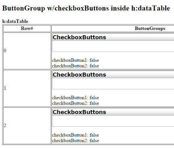
2.) buttonGroup fails to render buttons when in h:dataTable, ace:dataTable or ui:repeat. See screenshot group.PNG
Test apps located at:
http://dev.icesoft.com/svn/repo/qa/trunk/Regression-Icefaces4/Sparkle/Nightly/buttonGroup
http://dev.icesoft.com/svn/repo/qa/trunk/Regression-Icefaces4/Sparkle/Nightly/checkboxButton
As for point 1 above, the active styling as well as the border were intentionally removed, as per Ken's request. So, this is expected.
As for point 2, the buttons are actually rendered, but they aren't easily visible at first because those buttons use labels and because of the changes mentioned in the previous paragraph. We will find a way to avoid this situation.
Basically, the changes made were thinking of the standard case where we render the checkbox icons. When using a label, it is only displayed when the button is checked. So when the button is not checked, it presents no visual cues. Some possible solutions would be to render the label with a lighter shade of gray when not checked, or the unchecked box icon.
Also updated mobi components to use new FontAwesome version, updated mobile showcase page to use new icon class names, and removed old FontAwesome at revision 43067.
r43083: added ice-checkboxbutton-checked and ice-checkboxbutton-unchecked state CSS classes; adjusted paddings for checkbox labels; added opacity setting to labels of unchecked buttons.
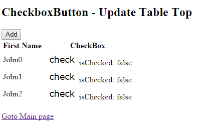
Tested with r43088. Issue 1 is resolved however issue 2 still remains. Checkbox buttons inside a group are not visible when inside h:dataTable, ace:dataTable or ui:repeat.
Test app located at:
http://dev.icesoft.com/svn/repo/qa/trunk/Regression-Icefaces4/Sparkle/Nightly/buttonGroup
For this, you'll have to modify the test app, since it is programmed not to show any label when the button is unchecked. Just remove that condition or dynamically change the label when it's unchecked.
Basically, the changes made were thinking of the standard case where we render the checkbox icons. When using a label, it is only displayed when the button is checked. So when the button is not checked, it presents no visual cues. Some possible solutions would be to render the label with a lighter shade of gray when not checked, or the unchecked box icon.
Why wouldn't we want the label rendered all the time, not just when it's selected?
Ok, this is actually not the case. That's what I thought when I used QA's app. The label is always rendered. What happens is that in the QA app, in a number of tests, the pages are programmed not to render any labels when the button is unchecked. See my previous comment.
QA test applications now updated and buttons are now visible when in a non-selected state. Thanks Art.
All issues verified ICEfaces 4 trunk r43088. Tomcat 7, IE, 11, FF 33, Chrome 38.
Committed new feature to trunk at revision 39847.