Details
-
Type:
 New Feature
-
Status: Closed
-
Priority:
 Major
Major
-
Resolution: Fixed
-
Affects Version/s: None
-
Component/s: ACE-Components
-
Labels:None
-
Environment:ICEfaces 3, ACE Components
-
Assignee Priority:P1
-
Affects:Documentation (User Guide, Ref. Guide, etc.), Sample App./Tutorial
Description
Add a new ace:textAreaEntry component with the following features:
- ThemeRoller styling support
- ace:ajax support
- promptLabel attribute (displays inside the inputText when the component doesn't have a value and is not focussed)
- Custom styling for invalid state (red border, etc. if entered value fails validation), and required (seeICE-7868).
- Resizability (optional) via dragging the bottom right corner.
- ThemeRoller styling support
- ace:ajax support
- promptLabel attribute (displays inside the inputText when the component doesn't have a value and is not focussed)
- Custom styling for invalid state (red border, etc. if entered value fails validation), and required (see
- Resizability (optional) via dragging the bottom right corner.
Issue Links
- depends on
-
 ICE-7868
Add support to all ACE input components for standard theme-based styling for components that are "required" or "invalid"
-

- Closed
-


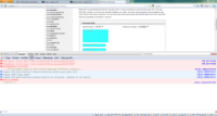
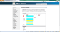
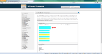
First pass. See screenshot-01.png. Immediate problem: with the label left and right positions, the alignment is at the bottom instead at the top. See screenshot-02.png.
Resizability is automatic by CSS3 "resize" property.