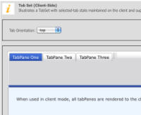
Completed a working prototype in supporting themeroller themes in tabSet.
It was straight-forward to make the component use the Themeroller theme that
was loaded on the page. However, there were a few issues:
- CSS class names to represent the current state (e.g. active, highlighted, etc.)
are hard-coded in the jQuery-ui Javascript code. So, it was necessary to override
the CSS class names used by YUI. Fortunately, YUI uses fields like ACTIVE_CLASSNAME
to hold the string value of the class name used for the active class (in YUI it's 'selected'
by default, while in jQuery-ui it's ui-state-active).
- While the colors, fonts, and background images of the theme can be applied
successfully to the component, the component doesn't look good right away. At the
end, the theme CSS is only concerned with colors, fonts and background images and
not so much with positions, spacing, margins, etc. So, it was necessary to add some
structural CSS styles for the component to look good. These structural CSS styles were
taken from jQuery-ui CSS.
- While the YUI Tabview and the jQuery Tabview widgets use a similar HTML structure
to initialize the widget, we add and modify some of the markup in the component, which
results in some styles not being applied correctly. So, it was necessary to make
adjustments to the structural CSS styles to work with our markup. Further, it might be
necessary to make some slight changes to the markup we render in order for the
component to look completely right. For example, we are rendering a <div> element
inside <li> elements to display the tab header; it was necessary to make some adjustments
to the structual CSS to apply the theme to this <div> element, but the code only
makes changes to the <li> element, so these changes are hidden by the styling of the <div> element.
 Improvement
 Major
Major
Completed a working prototype in supporting themeroller themes in tabSet.
It was straight-forward to make the component use the Themeroller theme that
was loaded on the page. However, there were a few issues:
are hard-coded in the jQuery-ui Javascript code. So, it was necessary to override
the CSS class names used by YUI. Fortunately, YUI uses fields like ACTIVE_CLASSNAME
to hold the string value of the class name used for the active class (in YUI it's 'selected'
by default, while in jQuery-ui it's ui-state-active).
successfully to the component, the component doesn't look good right away. At the
end, the theme CSS is only concerned with colors, fonts and background images and
not so much with positions, spacing, margins, etc. So, it was necessary to add some
structural CSS styles for the component to look good. These structural CSS styles were
taken from jQuery-ui CSS.
to initialize the widget, we add and modify some of the markup in the component, which
results in some styles not being applied correctly. So, it was necessary to make
adjustments to the structural CSS styles to work with our markup. Further, it might be
necessary to make some slight changes to the markup we render in order for the
component to look completely right. For example, we are rendering a <div> element
inside <li> elements to display the tab header; it was necessary to make some adjustments
to the structual CSS to apply the theme to this <div> element, but the code only
makes changes to the <li> element, so these changes are hidden by the styling of the <div> element.