ICEfaces
  1. ICEfaces
  2. ICE-10716

New ace:checkboxButtons component

    Details

    • Type: New Feature New Feature
    • Status: Closed
    • Priority: Major Major
    • Resolution: Fixed
    • Affects Version/s: None
    • Fix Version/s: 4.1
    • Component/s: ACE-Components
    • Labels:
      None
    • Environment:
      ICEfaces 4
    • Affects:
      Documentation (User Guide, Ref. Guide, etc.), Sample App./Tutorial

      Description

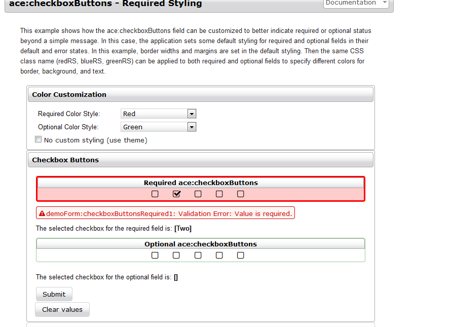
      This JIRA is to add a new ace:checkboxButtons component that would support stamping out a set of checkboxButtons based on one component tag, similar to the h:selectBooleanCheckbox component.

      This would support all the styling/attributes of the existing ace:checkboxButton component, but would support f:selectItems to define the buttons and would use a single value attribute to define the currently selected checkboxButton.
      1. image1.png
        11 kB
      2. image2.png
        28 kB

        Activity

        Hide
        Ken Fyten added a comment -

        As an alternative to creating this new component, it might be preferable to instead enhance the existing ace:buttonGroup component such that it could be used to generate a list of either radio or checkbox buttons itself. The main goal of this JIRA is to enable easier use of the checkbox or radio buttons by reducing the amount of backing-bean code required to use them.

        By having the ace:buttonGroup manage the state of the buttons directly, such that the application would value-bind to the buttonGroup to see which button(s) were currently selected, instead of having to implement and manage the state for each button value separately.

        Adding a new "type=radio/checkbox" attribute to the ace:buttonGroup is one way of triggering this mode of rendering where it would not only manage the state of the buttons, but also render the buttons itself as well.

        If this seems feasible it is probably more desirable than implementing this new component and a new enhancement JIRA should be created for the ace:buttonGroup solution and this JIRA marked Won't Fix and closed.

        Show
        Ken Fyten added a comment - As an alternative to creating this new component, it might be preferable to instead enhance the existing ace:buttonGroup component such that it could be used to generate a list of either radio or checkbox buttons itself. The main goal of this JIRA is to enable easier use of the checkbox or radio buttons by reducing the amount of backing-bean code required to use them. By having the ace:buttonGroup manage the state of the buttons directly, such that the application would value-bind to the buttonGroup to see which button(s) were currently selected, instead of having to implement and manage the state for each button value separately. Adding a new "type=radio/checkbox" attribute to the ace:buttonGroup is one way of triggering this mode of rendering where it would not only manage the state of the buttons, but also render the buttons itself as well. If this seems feasible it is probably more desirable than implementing this new component and a new enhancement JIRA should be created for the ace:buttonGroup solution and this JIRA marked Won't Fix and closed.
        Hide
        Arturo Zambrano added a comment -

        So far it seems like it would be more convenient to have these additional components, instead of enhancing ace:buttonGroup. While working on this, I ran into several challenges and questions. The most important one is that if we enhance ace:buttonGroup, the end result would be a hybrid component between a container and an input component. It would depend on whether the component has a value and a 'type' attribute set to act as an input element or not. It might not be very intuitive from the user perspective how this component would work under different circumstances, and from the development perspective it's actually easier and cleaner to create and maintain separate components: the container component (ace:buttonGroup) and the input components (ace:checkboxButtons and ace:radioButtons), which would act similarly to the standard h:selectManyCheckbox. The names of these components also make it more evident to the user what function they perform.

        Also, if we add a 'type' attribute to ace:buttonGroup, we would have to set a default value (checkbox or radio), and there's no obvious choice for this that would make sense for all users. Otherwise, we might just decide not to render anything if there's no type attribute.

        It's not possible to just take the renderers for ace:checkboxButton and ace:radioButton and ask them to render each individual button generated by the container. A lot of things have to be changed in the client side and the server side to make things work as desired. There's no choice but to copy a lot of the original renderer code into the new components. So, if we keep things separate it will be also easier to maintain.

        So far, I have basic versions of these two new components. There are more details to add like conversion, validation, implement a behaviour for the 'required' attribute, decide how to handle labels, ajax and aria.

        Show
        Arturo Zambrano added a comment - So far it seems like it would be more convenient to have these additional components, instead of enhancing ace:buttonGroup. While working on this, I ran into several challenges and questions. The most important one is that if we enhance ace:buttonGroup, the end result would be a hybrid component between a container and an input component. It would depend on whether the component has a value and a 'type' attribute set to act as an input element or not. It might not be very intuitive from the user perspective how this component would work under different circumstances, and from the development perspective it's actually easier and cleaner to create and maintain separate components: the container component (ace:buttonGroup) and the input components (ace:checkboxButtons and ace:radioButtons), which would act similarly to the standard h:selectManyCheckbox. The names of these components also make it more evident to the user what function they perform. Also, if we add a 'type' attribute to ace:buttonGroup, we would have to set a default value (checkbox or radio), and there's no obvious choice for this that would make sense for all users. Otherwise, we might just decide not to render anything if there's no type attribute. It's not possible to just take the renderers for ace:checkboxButton and ace:radioButton and ask them to render each individual button generated by the container. A lot of things have to be changed in the client side and the server side to make things work as desired. There's no choice but to copy a lot of the original renderer code into the new components. So, if we keep things separate it will be also easier to maintain. So far, I have basic versions of these two new components. There are more details to add like conversion, validation, implement a behaviour for the 'required' attribute, decide how to handle labels, ajax and aria.
        Hide
        Arturo Zambrano added a comment -

        r45849: committed new ace:checkboxButtons component

        Show
        Arturo Zambrano added a comment - r45849: committed new ace:checkboxButtons component
        Hide
        Arturo Zambrano added a comment -

        r45850: added Overview demo to showcase.

        Show
        Arturo Zambrano added a comment - r45850: added Overview demo to showcase.
        Hide
        Arturo Zambrano added a comment -

        r45861: committed some styling adjustments
        r45862: added label, indicator, and required styling demos

        Show
        Arturo Zambrano added a comment - r45861: committed some styling adjustments r45862: added label, indicator, and required styling demos
        Hide
        Arturo Zambrano added a comment -

        r45874: modified rendering behaviour when the submitted value is invalid, to render the invalid submitted value instead of the previous valid value, in order to apply invalid styling consistently and allow the user to correct the input

        Show
        Arturo Zambrano added a comment - r45874: modified rendering behaviour when the submitted value is invalid, to render the invalid submitted value instead of the previous valid value, in order to apply invalid styling consistently and allow the user to correct the input
        Hide
        Arturo Zambrano added a comment -

        r45875: removed unnecessary resource files from the resource examples; modified the way the values are displayed to make them more presentable.

        Show
        Arturo Zambrano added a comment - r45875: removed unnecessary resource files from the resource examples; modified the way the values are displayed to make them more presentable.

          People

          • Assignee:
            Arturo Zambrano
            Reporter:
            Ken Fyten
          • Votes:
            0 Vote for this issue
            Watchers:
            3 Start watching this issue

            Dates

            • Created:
              Updated:
              Resolved: