Details
-
Type:
 New Feature
-
Status: Closed
-
Priority:
 Major
Major
-
Resolution: Fixed
-
Affects Version/s: None
-
Fix Version/s: 3.1.0.BETA2, 3.1
-
Component/s: ACE-Components
-
Labels:None
-
Environment:ICEfaces 3, ACE Components
-
Assignee Priority:P1
-
Affects:Documentation (User Guide, Ref. Guide, etc.), Sample App./Tutorial
Description
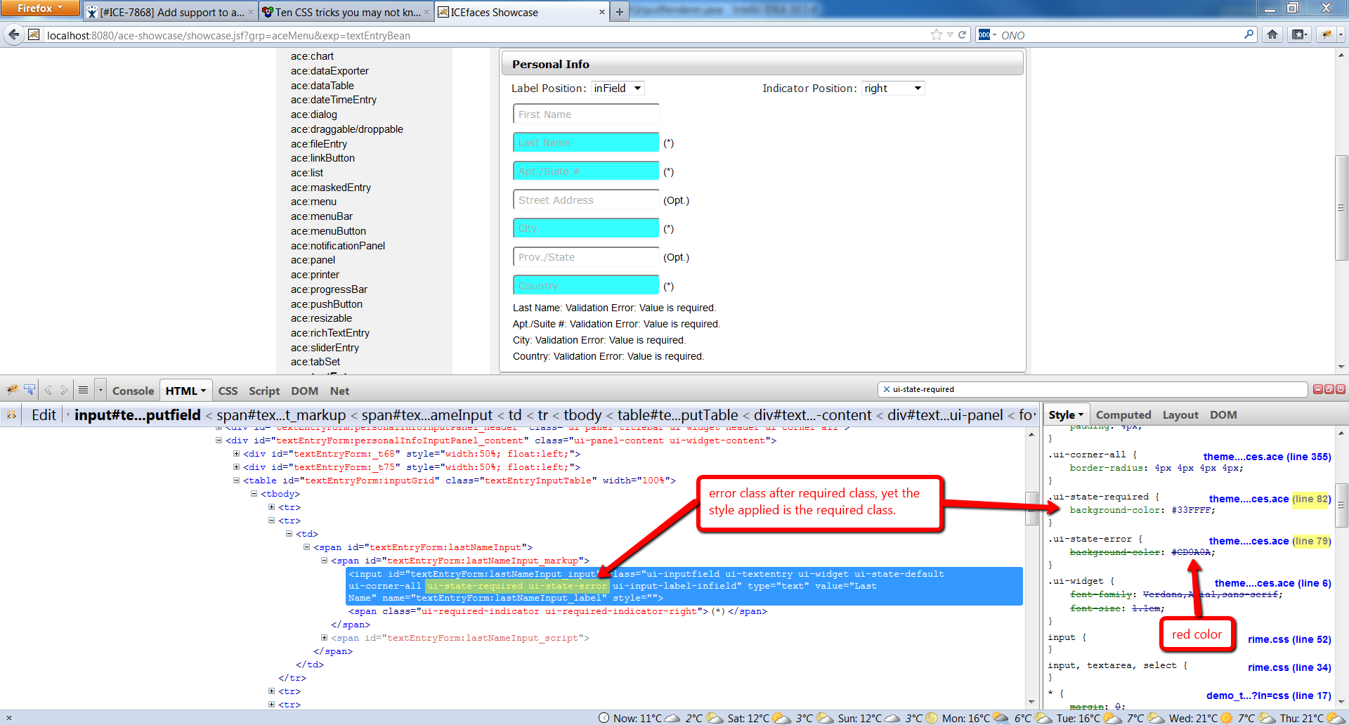
A useful new feature applicable to all ACE entry / input components is to add standard theme style support for indicating that a component has one of the following states:
- Required - If the component is "required=true", a custom style can be used to visually indicate its "required" status. Might also want to consider a custom renderer mode that would render additional markup (such as an asterisk character).
- Invalid - If the component is in an invalid state (has failed validation during it's most recent execution) a custom theme style can be used to visually indicate its "invalid" status (such as surrounding it with a thick red border, etc.).
By adding standard style-classes to all ACE input components for these states it becomes straightforward for users to customize this styling as needed.
Issue Links
Activity
- All
- Comments
- History
- Activity
- Remote Attachments
- Subversion