Details
-
Type:
 Improvement
-
Status: Closed
-
Priority:
 Major
Major
-
Resolution: Fixed
-
Affects Version/s: 4.0
-
Fix Version/s: EE-4.0.0.GA, 4.1
-
Component/s: MOBI-Components
-
Labels:None
-
Environment:ICEfaces 4
-
Assignee Priority:P2
Description
Since the IF4 mobi components now longer support those mobile device themes, this behaviour has been lost. This JIRA is to consider adding this feature back, either by including it the structural CSS of the mobi:fieldSetRow component, or possibly via a new custom ThemeRoller theme?
Activity
- All
- Comments
- History
- Activity
- Remote Attachments
- Subversion
Alternatively the input/second component could just float: right?
Yes, according to MOBI-1083 it was floating right in ICEmobile, so that would be the equiv. behaviour here.
r43975: added mobile device specific stylesheet.
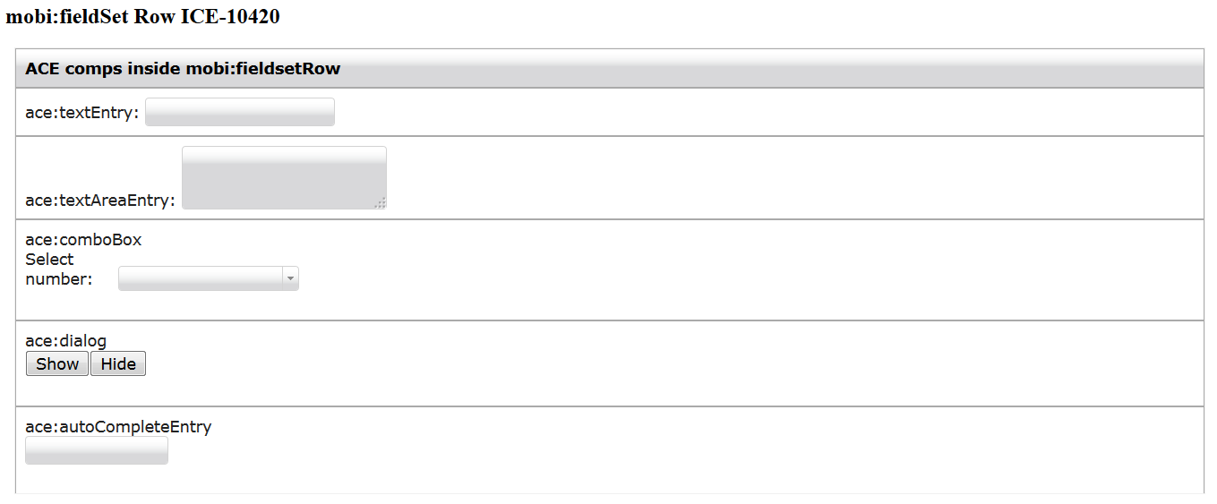
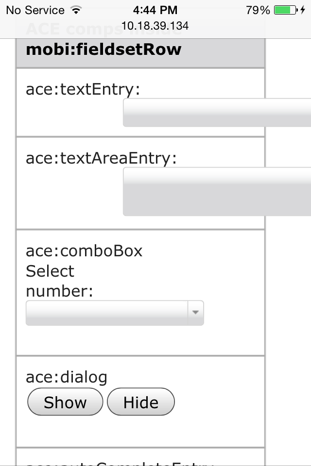
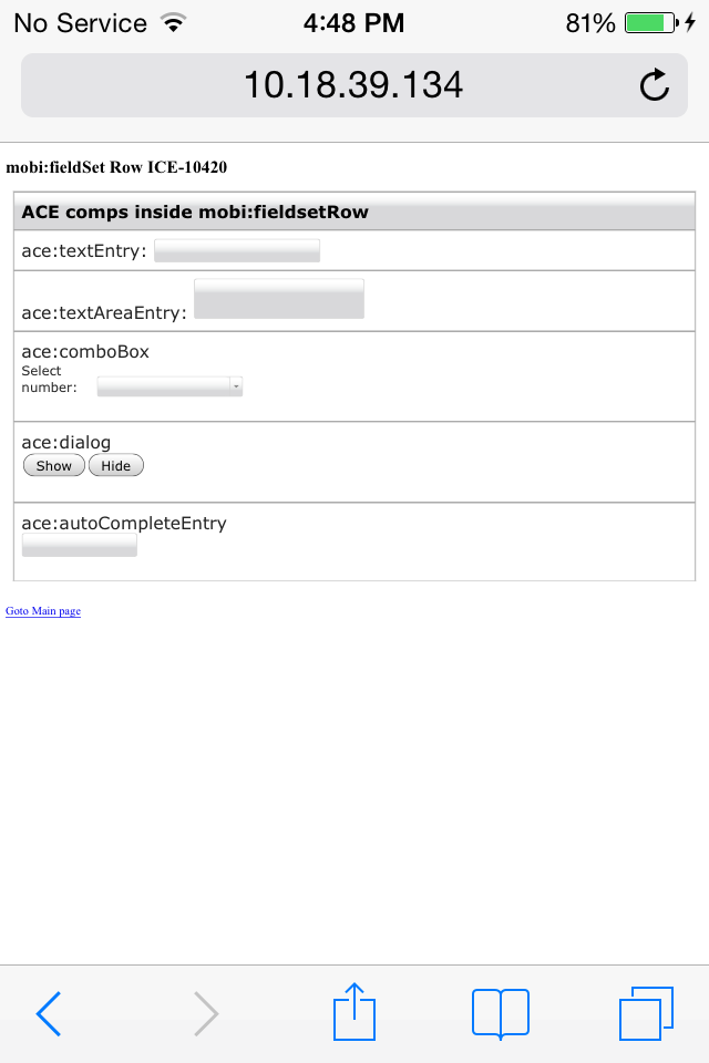
A new CSS file was created that is only added to non-desktop devices (e.g. smartphones, tablets). This is done via the ace:deviceResource component. The fieldset rows now look as in screenshot-10420-1.jpg, only on mobile devices. On the desktop, the fieldset rows look the same as before.
At the moment, the styling added for fieldset rows on moblie devices is relatively simple.
.ui-field-contain .mobi-fieldset-row input,
.ui-field-contain .mobi-fieldset-row textarea {
display:inline-block;
float: right;
width: 58%;
}
This is only applied to 'input' and 'textarea' elements. Just as in ICEmobile, the mobile-specific styling is only applied to 'input' and 'textarea' elements. So, it might not look well for more complex components like ace:comboBox (which uses different elements to create a down-arrow button, etc.).
Question 1: is it alright to assume that only 'input' and 'textarea' elements will be used in fieldset rows? or, should we add support for other elements like 'select' and more complex components like ace:comboBox?
r43987: modified fix to apply the special styling to last direct child of the fieldset row, whatever it is, in order to support other, more complex input components; added technique to account for height of floated elements in the current row.
44043: committed styling fixes specific for certain components to appear right-aligned and using 50% of the available width on non-desktop environments.
After seeing the issues reported above and the issues reported in ICE-10476 and seeing how components are being used inside mobi:fieldSet rows, it is no longer the aim of this JIRA to modify the styling of ALL components that appear at the end of a field set row. The fixes just committed only affect the components that make the most sense to be used in mobile environments in this fashion, which are all standard h: components that render either an <input>, <textarea> or <select> element as their root/only node, ace:textEntry, ace:textareaEntry, ace:maskedEntry, ace:simpleSelectOneMenu, mobi:flipswitch, mobi:dateSpinner, and mobi:timeSpinner.
The above was determined after surveying all ACE and MOBI components. All other components are simply not very likely to be used inside a mobifieldSet row with the intention to occupy the right 50% of the area, such as container components, buttons, data components, utility components, and other complex components like ace:gMap and ace:chart. The only components that still make sense to be used in this fashion but weren't included in the fixes above are ace:autoCompleteEntry, ace:comboBox, ace:selectMenu and ace:slider. The issue with these components is that they have their own 'width' or 'length' attributes, so their widths cannot be easily modified by general CSS classes only.
A CSS class was also added to this mobile stylesheet (that is only loaded on non-desktop environments when having mobi:deviceResource on the page) that users can add arbitrarily to other components to make them align to the right when inside a mobi:fieldSet row. This class is 'mobi-float-right'.
The only remaining issue is that when using this mobile stylesheet, the mobi:dateSpinner and mobi:timeSpinner components will have the popup button to the left when being in the non-native mode. This is due to the way in which the markup for these components in rendered, and can be fixed by changing the current way of rendering this markup.
Let's go ahead have it at least position the buttons and ace:select*, ace:autoComplete, etc. components so that the they are left-aligned with the other components, and let the width be determined as usual in those cases.
r44046: moved open/close button inside the root node of mobi:dateSpinner and mobi:timeSpinner when in non-native mode; adjusted special styling on mobile devices for these
r44048: added style class names to root nodes of ace:autoCompleteEntry and ace:sliderEntry
r44049: added special styling for ace:autoCompleteEntry, ace:comboBox, ace:selectMenu and ace:sliderEntry
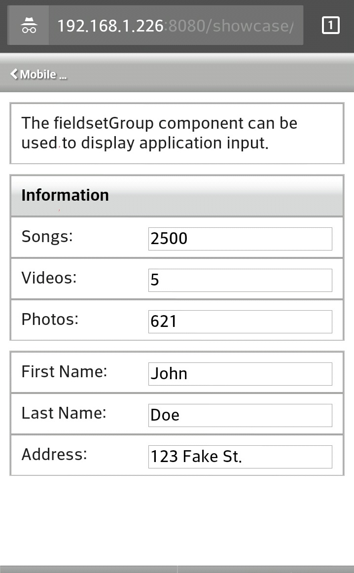
It's still debatable if button components should have this special styling as well (align them to the right), since in our apps, we've been placing either a single button or a group of buttons in the same fieldSet row, as can be seen in the screenshots attached to ICE-10476, so this styling will cause that all or one of those buttons in the row be aligned to the right, while there's nothing to the left of them.
r44076: added special styling to center buttons.
Buttons now appear at the center, one on top of the other (vertically), if there are more then one.
This styling applies specifically to <input> elements of type 'button' and 'submit', to <button> elements, to all 8 bridgeit button components (mobi:camcorder, mobi:camera, mobi:cloudPush, mobi:fetchContact, mobi:geoTrack, mobi:microphone, mobi:scan, and mobi:sms), and to four ACE button components (ace:checkboxButton, ace:linkButton, ace:pushButton, and ace:radioButton).
FYI, an example of the original ICEmobile styling that achieved this is captured below (iPad mini theme):
.ui-field-contain input.ui-input-text, .ui-field-contain textarea.ui-input-text, .ui-field-contain .ui-input-search, .ui-field-contain div.ui-input-text {
    display: inline-block;
    width: 58%;
}